Good User Experience Leads to Good Security


Good User Experience Leads to Good Security
People are experts at avoiding things they dislike. You don’t want security to fall into that category.
In the product world, the impact of a poor user experience (UX) is pretty simple: Poorly designed products will suffer from little to no utilization, and perhaps a complete lack of adoption.
Designer Frank Chimero said it best; “People ignore design that ignores people.”
Design is more than how a product looks; it’s really how it works.
Customers have higher expectations for UX today than ever before. People are getting used to better and more effective design. End users are no longer delighted at seamless and intuitive; they expect it.
When it comes to cybersecurity products, UX becomes even more important because the people who use the products often don’t have the option to not adopt them. The products may be chosen and imposed on them by their company’s IT group. Why is that scary? Because end users will find workarounds that are often even more unsafe / unsecure than the issue the product was trying to solve.
Security needs to be seamless, just a part of the normal flow. It shouldn’t stop a user in their tracks. For security to stick, it needs to be designed effectively, or else you'll inadvertently introduce even more risk.
But, how do we strike the optimal balance between good UX and good security?
The Secure and Usable Balance
Let’s look at an example where UX suffers because of a security need, and where making the UX better creates a security hole.
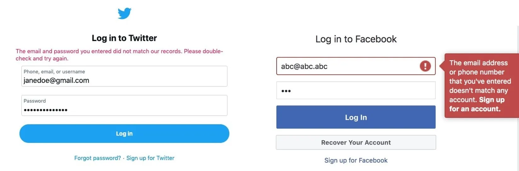
When failing to log into Twitter, the error message doesn’t tell the user which of the two inputs they got wrong. The password or the email address. That’s kind of annoying, right? What if you mistyped your email or forgot which one of your many email addresses you used when you signed up for Twitter? This isn’t good UX. Error messages should be as specific as possible. But there’s a very good security reason why this error message is formatted this way.
Facebook’s error message lets the user know there isn't a profile that exists linked to that email address, or maybe more importantly, it would tell the user when a profile does exist linked to that email address.
Maybe it doesn’t hurt to have the user base leaked for a service like Facebook because pretty much everyone is on it, but I bet you can imagine many services out there where a leaked user base could have serious implications.
It’s problems like this that make people believe that security is a hindrance to UX and that good UX results in bad security.
Security is a choice people make, and if you make it difficult people will not choose it. The idea is that by minimizing friction and simplifying processes, you can help users to make better choices for their security. In reality, good user experience leads to better security.
If it’s Not Usable, it’s Not Secure
Jared Spool, a highly regarded UX expert, said it best when he summarized a key principle of security: “If it’s not usable, it’s not secure.”
You may have seen the video of Kanye West’s visit with former President Trump. The camera caught Kanye unlocking his phone with the passcode 0-0-0-0-0-0.
There’s a reason people use a passcode of 0-0-0-0-0-0. They know it’s not secure, but, for them, a secure one isn’t as “usable”; it’s not as quick to enter or as easy to remember. When it comes to accessing your phone, which now-a-days is pretty much your lifeline to everything from contacting people to unlocking your front door, speed is paramount for the average person, security is secondary.
Enter biometrics. Biometrics is a huge step forward in security and User Experience and is a perfect example of how UX can enhance security.
Unlocking your phone with your fingerprint (or by scanning your face) is much easier than entering a passcode.. This method of verification can be a win-win. People are eager to adopt biometrics because it’s easier and faster, which in turn makes it more secure because people will actually use it instead of finding ways to avoid it. Of course, biometrics are not unhackable, so combining the use of biometric verification with multifactor authentication is the more secure option for protecting enterprise systems.
Human Error or System Error?
Besides people avoiding security, or finding workarounds, there’s also plain “human error” to consider.
Human error plays a role in the majority of cybersecurity breaches today. Does that high number reflect a high number of careless people? I argue no, it’s a design problem.
In 1979, the Three Mile Island accident was a partial nuclear meltdown that occurred in Pennsylvania. It was the worst accident in U.S. commercial nuclear power plant history.
How did it happen? A valve was stuck open, which allowed large amounts of nuclear reactor coolant to escape, and the operators of the power plant didn’t make any attempts to close the valve. Why? Because they didn’t know it was stuck open.
The control panel at the nuclear facility had a UX problem. There was a status indicator on the panel that seemed to indicate that the valve was closed, but the indicator was actually indicating that the valve had power. The control room operators misinterpreted the indicator’s meaning, so the real problem went undiagnosed for hours. A simple accompanying label or button could have avoided, or at least diminished, the impact of this massive accident. A good UI makes it hard for people to err, and easy to recover from if they do make an error. The solution is not to scold users or to give them more extensive training. The answer is to redesign the system to be less error-prone.
Don Norman is one of the founders of NN/g, a UX research and consulting firm trusted by leading organizations worldwide to provide reliable guidance on user experience. In his book, The Design of Everyday Things, he argues that “Human error” is usually a result of poor design, and should be called “system error” instead. In Norman’s view, it is human nature to make mistakes. Thus, product makers should try to anticipate how mistakes could be made, design the system to prevent mistakes, and to put measures in place that help account for potential mistakes that aren’t able to be anticipated.
How to Help People Make Secure Choices
The Mailchimp sign up form shown below is an example of how good UX can help people comply with security measures.
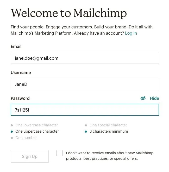
A strong password has a lot of rules, which is daunting for the average user, but the Mailchimp sign up form shows these rules upfront; they are not hidden behind a popover or only shown on error. The user is not expected to just know the rules of a strong password.
As the user types in the password field, the rules grey out once they’re met. This shows the user they’re making progress and gives them positive reinforcement. The Sign Up button is disabled until all the rules are met. This avoids the user encountering a disruptive error message telling them their password isn’t strong enough. Error messages leave the user with a feeling of unease. When people get nervous, they make mistakes.
Here are a few tips when designing a system:
1. Don’t use fear as a motivator to follow security practices: Fear is a negative emotion that triggers fight or flight response. This will not invoke a feeling of trust or a positive feeling toward your brand. When people are afraid, they make mistakes and mistakes lead to security breaches.
2. Celebrate users’ participation in security: When a user completes a task associated with security, celebrate their success with graphics and copy. Associate as many positive emotions as possible when someone interacts with security functions, and try to dispel any negative associations. Don’t underestimate the power of a green check mark for a job well done.
3. Explain why to your users: Explain why security precautions are necessary. It helps the user understand, which makes things seem less like just plain annoyances. It also can make the user feel like they’re participating in something worthwhile and being a part of the solution. Make them a partner in their own security.
4. Plan for mistakes: Users are human and humans make mistakes. First, of course, design the system in a way that it’s difficult for a person to make a mistake in the first place, but make it easy for that person to recover from any mistakes they may make.
Security measures are required, we all know that, and users expect it. But for it to work the products need to be adopted and used. People will find a way to the path of least resistance. The single best predictor of behavior is ease. The easier something is to do; the more likely people are to do it. That’s why good UX, making something easy and understandable, is so important for security.
If you’re a UX professional interested in the rewarding and challenging field of security, consider applying for one of our open UX roles. Our UX team is growing and we’re always looking for talented, passionate individuals who understand the balance and importance of good and secure user experience.